

Effortless forms, with standards.
Features:
- Instant form generation based on your JSON schemas.
- Integrates within your OpenAPI / JSON schema / MongoDB (BSON) stack.
- Comes with sensible defaults, while aiming for extensibility (themes, widgets…).
- ⚡️ Fast, and light 🪶.
Use cases:
- Quick CRUDs for you backends (JS, Python, PHP, Ruby…).
- Lightly interactive websites contact forms.
- Building block for custom CMSes.
- Building block for Markdown YAML frontmatter editors.
- Form builders… builder (🪆)
- You name it…
Due to their declarative and serializable nature, JSON schemas are highly interoperable and portable.
Moreover, UI schemas can be declared alongside to customize the view layer.
You can also override totally one ore more widgets, or just sprinkle some styles on top of the included ones.
Why?
While there is a handful of project for major frontend frameworks, there wasn't any Web Component packing all the features above.
Also if your are evaluating Web Component design systems or if you are building your own, this library is providing you a handy testbed.
See also the inspirations for this project.
Caution
Not for production.
Code is actually under a major rewrite.
Expect the doc. to be not in sync. with the actual released code.


Jump to implementations:
— Pure HTML (CDN)
— TypeScript only (DOM)
— Astro (SSR) —
— Lit
— Solid
— Vue
— Svelte
— (P)React
—
🗂️ Table of Contents
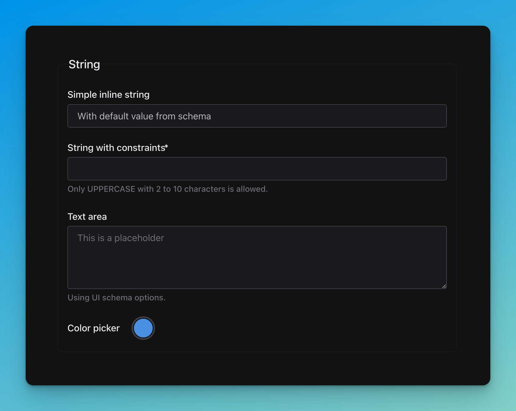
title: String
required:
  - stringConstrained

properties:
  simpleString:
    title: Simple inline string
    type: string
    default: With default value from schema

  stringConstrained:
    title: String with constraints
    type: string
    pattern: '^[A-Z \d\W]+$'
    minLength: 2
    maxLength: 10
    description: Only UPPERCASE with 2 to 10 characters is allowed.

  textArea:
    title: Text area
    description: Using UI schema options.
    type: string

  color:
    title: Color picker
    type: string
    default: '#4a90e2'
# UI schema
textArea:
'ui:widget': textarea
'ui:placeholder': This is a placeholder
color:
'ui:widget': color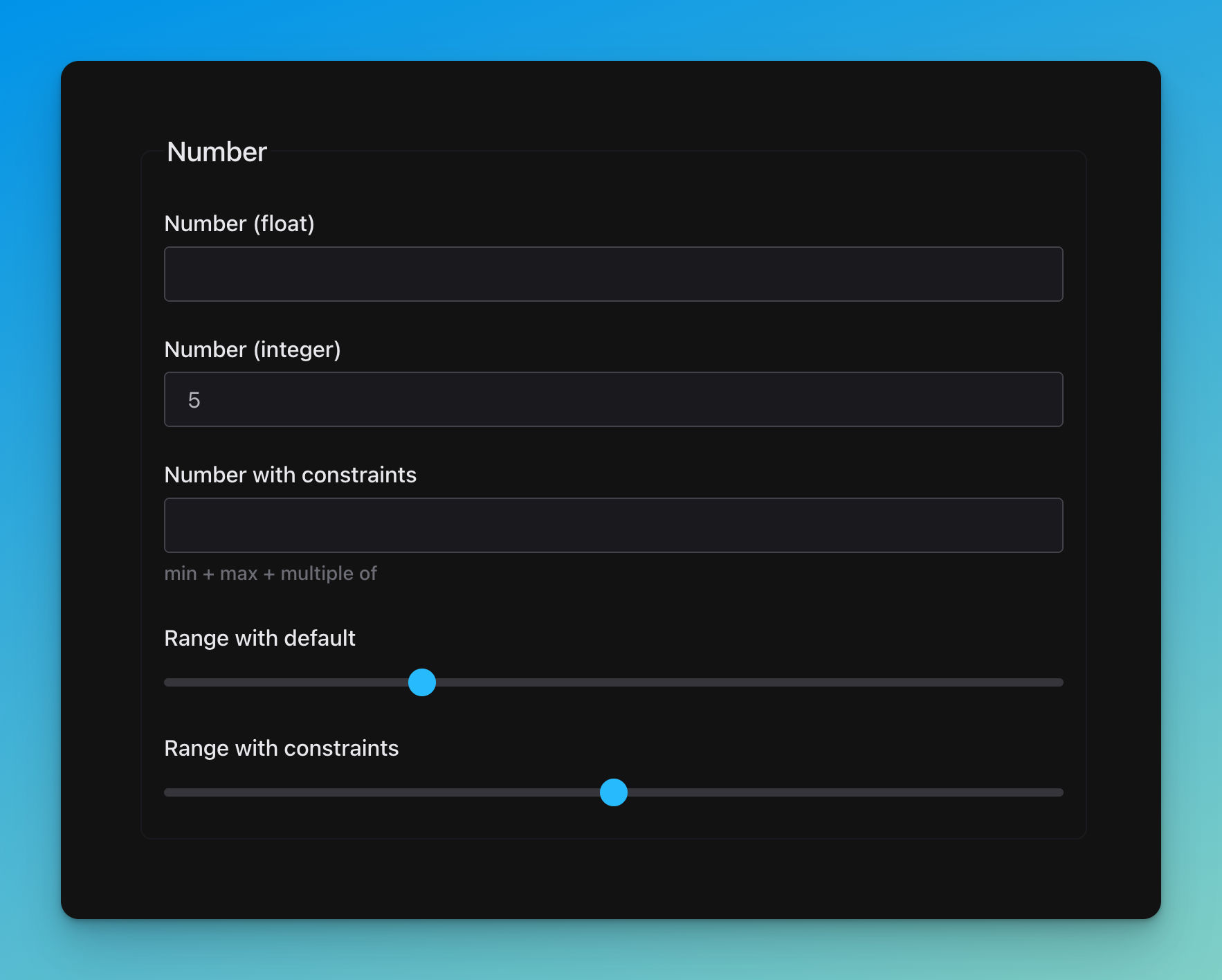
title: Number

properties:
  float:
    title: Number (float)
    type: number

  integer:
    default: 5
    title: Number (integer)
    type: integer

  numberConstrained:
    title: Number with constraints
    description: min + max + multiple of
    type: integer
    minimum: 50
    maximum: 100
    multipleOf: 10

  range:
    title: Range with default
    default: 28
    type: integer

  rangeConstrained:
    title: Range  with constraints
    type: integer
    minimum: -50
    maximum: 50
    multipleOf: 25
# UI schema
range:
'ui:widget': range
rangeConstrained:
'ui:widget': range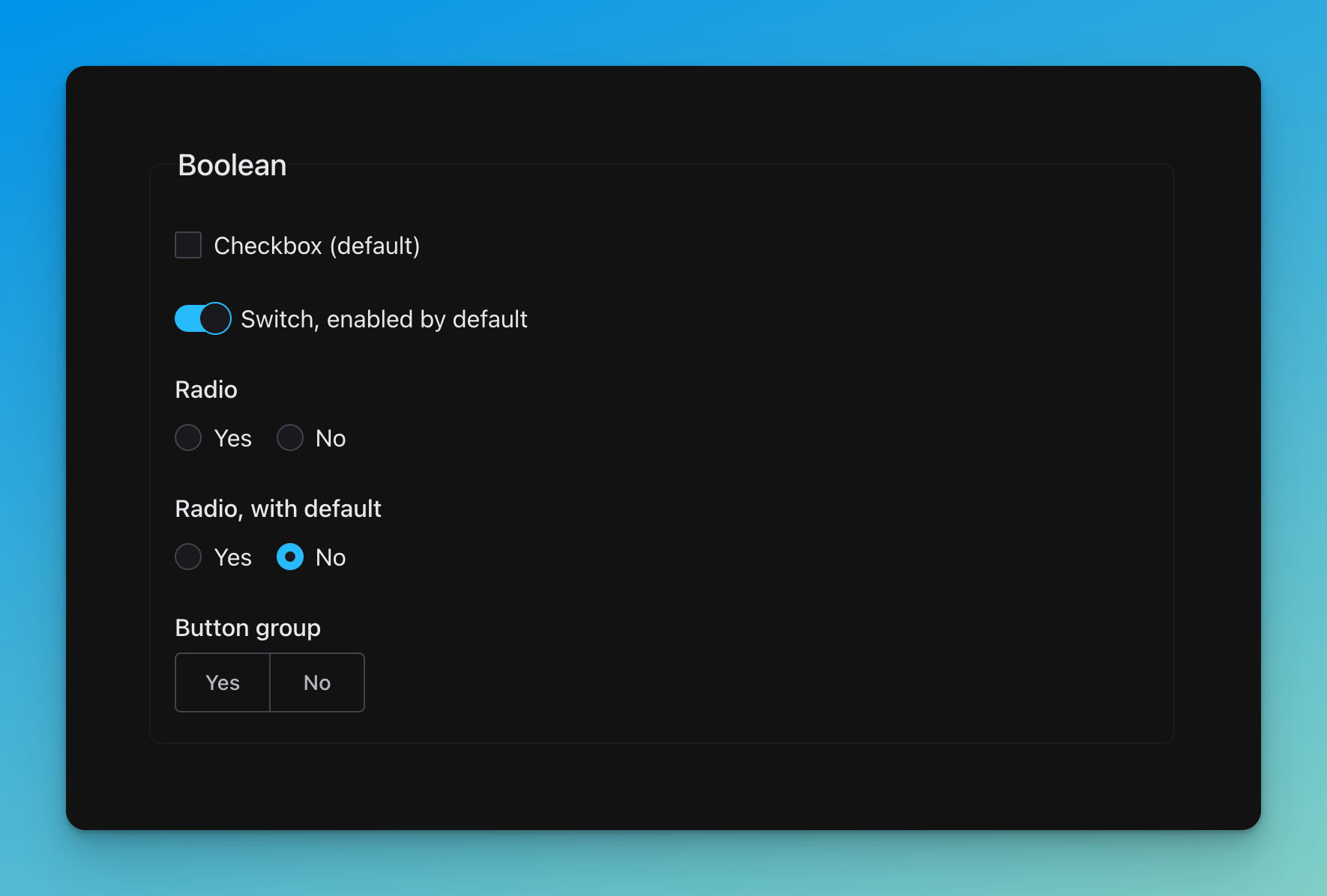
title: Boolean

properties:
  checkbox:
    title: Checkbox (default)
    type: boolean

  switch:
    title: 'Switch, enabled by default'
    type: boolean
    default: true

  radio:
    title: Radio
    type: boolean

  radioWithDefault:
    title: 'Radio, with default'
    type: boolean
    default: false

  buttonGroup:
    title: Button group
    type: boolean
# UI schema
switch:
'ui:widget': switch
radio:
'ui:widget': radio
radioWithDefault:
'ui:widget': radio
buttonGroup:
'ui:widget': button-group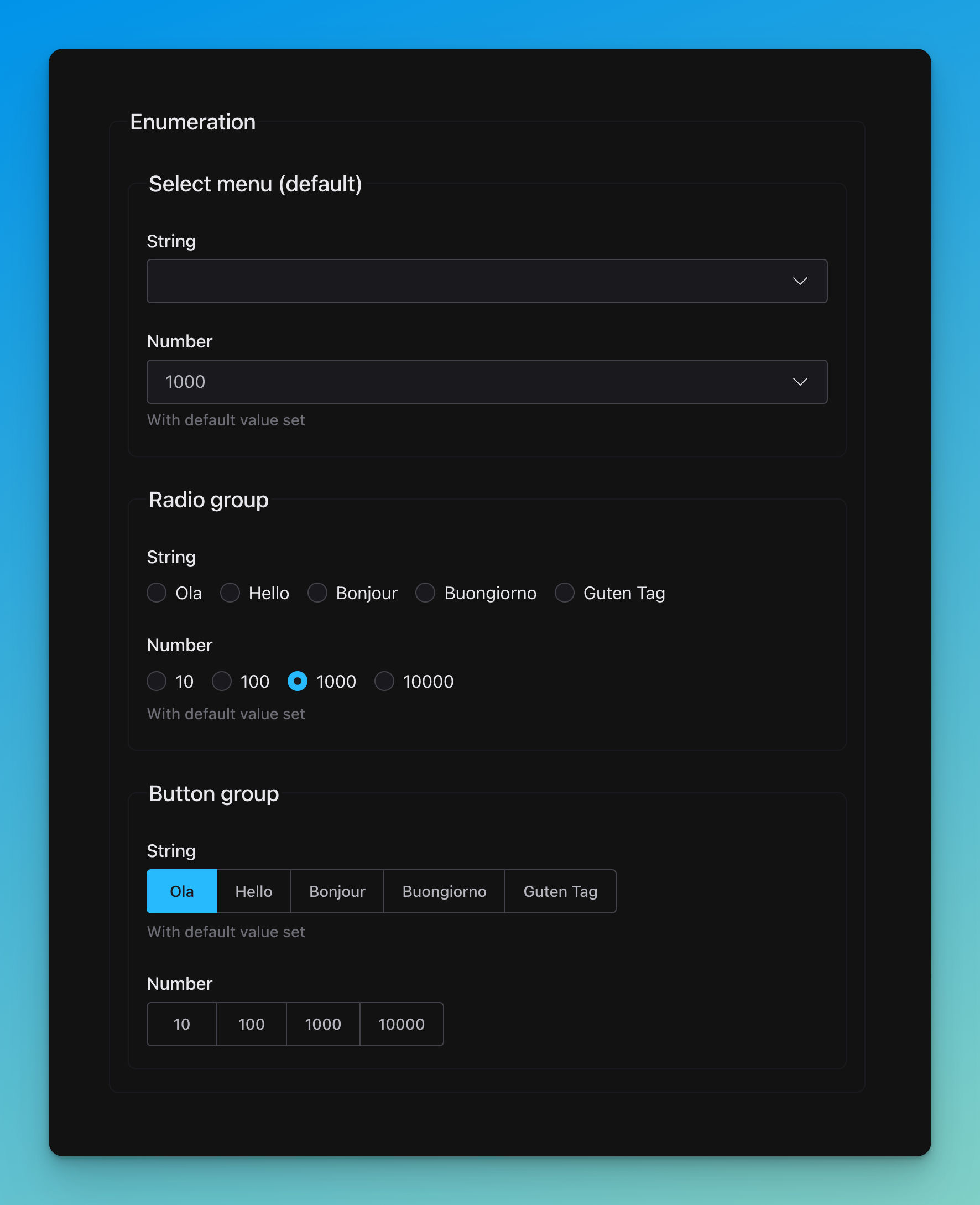
title: Enumeration

properties:
  select:
    title: Select menu (default)
    properties:
      string:
        title: String
        type: string
        enum: [Ola, Hello, Bonjour, Buongiorno, Guten Tag]
      number:
        title: Number
        type: number
        enum: [10, 100, 1000, 10000]
        description: With default value set
        default: 1000

  radio:
    title: Radio group
    properties:
      string:
        title: String
        type: string
        enum: [Ola, Hello, Bonjour, Buongiorno, Guten Tag]
      number:
        title: Number
        type: number
        enum: [10, 100, 1000, 10000]
        description: With default value set
        default: 1000

  buttonGroup:
    title: Button group
    properties:
      string:
        title: String
        type: string
        enum: [Ola, Hello, Bonjour, Buongiorno, Guten Tag]
        default: Ola
        description: With default value set
      number:
        title: Number
        type: number
        enum: [10, 100, 1000, 10000]
# UI schema
radio:
string:
'ui:widget': radio
number:
'ui:widget': radio
buttonGroup:
string:
'ui:widget': button-group
number:
'ui:widget': button-group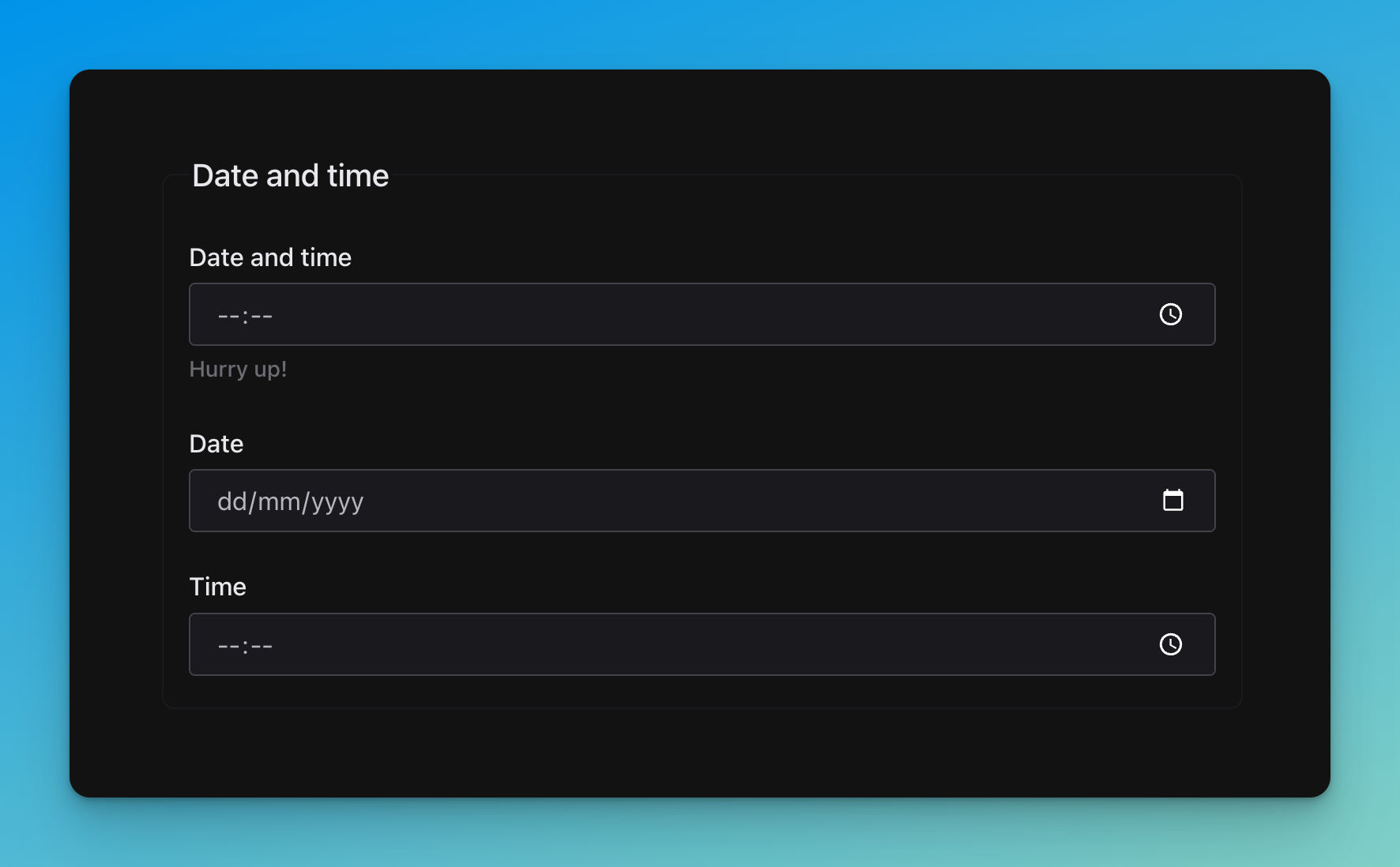
title: Date and time

properties:
  datetime:
    title: Date and time
    description: Hurry up!
    type: string
    format: date-time

  date:
    title: Date
    type: string
    format: date

  time:
    title: Time
    type: string
    format: time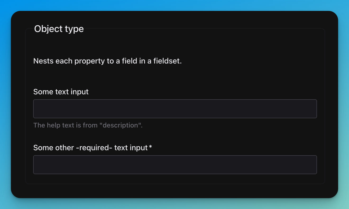
title: Object type
description: Nests each property to a field in a fieldset.
required:
  - textBar

properties:
  textFoo:
    title: Some text input
    type: string
    description: The help text is from "description".

  textBar:
    title: Some other -required- text input
type: string🚧……🚧
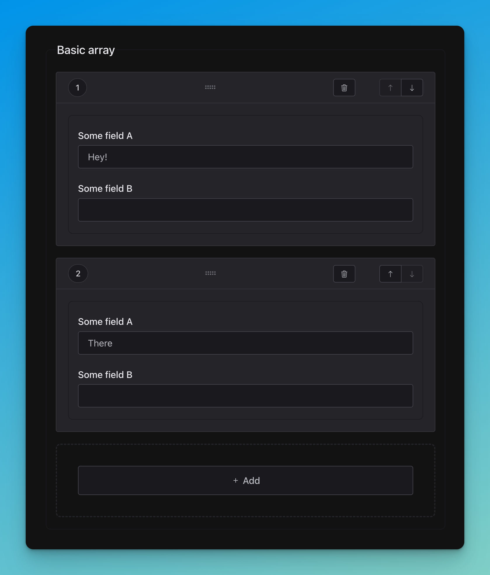
title: Basic array
type: array

items:
  properties:
    textA:
      title: Some field A
      type: string
    textB:
      title: Some field B
      type: string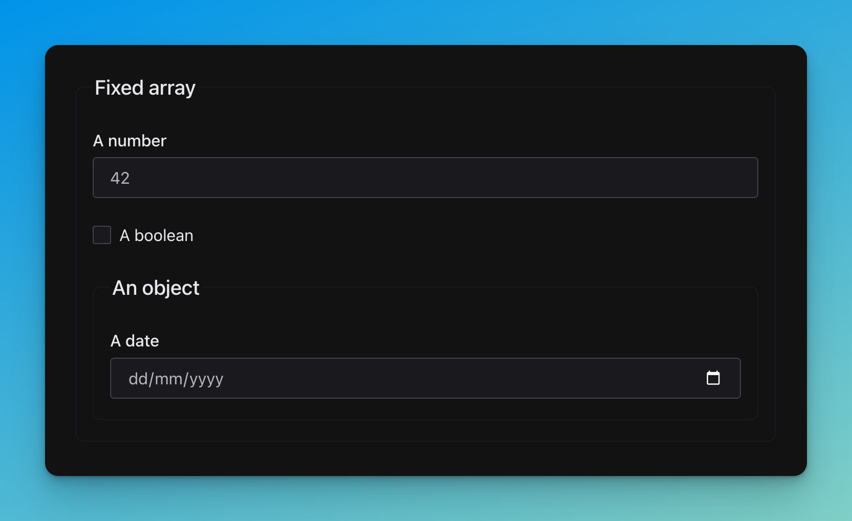
title: Fixed array
type: array

items:
  - title: A number
    type: number
    default: 42
  - title: A boolean
    type: boolean
    default: false
  - title: An object
    properties:
      when:
        title: A date
        type: string
        format: date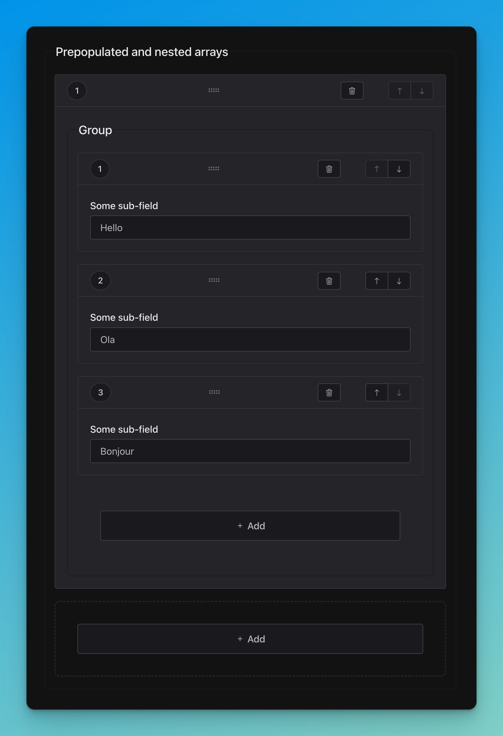
title: Prepopulated and nested arrays
type: array

items:
  title: Group
  type: array

  items:
    title: Some sub-field
    type: string
# Data
prepopulatedNested:
- - Hello
- Ola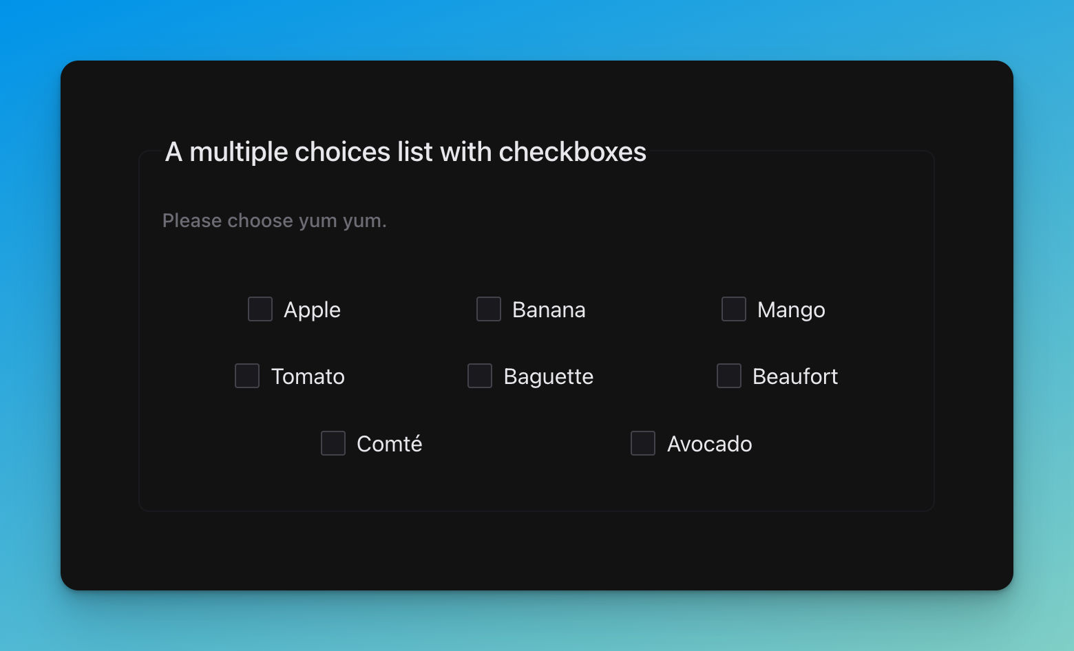
title: A multiple choices list with checkboxes
description: Please choose yum yum.
type: array
uniqueItems: true

items:
  type: string
  enum:
    - Apple
    - Banana
    - Mango
    - Tomato
    - Baguette
    - Beaufort
    - Comté
- Avocado🚧……🚧
🚧……🚧
🚧……🚧
🚧……🚧
🚧……🚧
🚧……🚧
🚧……🚧
🚧……🚧
🚧……🚧
🚧……🚧
This is for the bare package. You'll have to bring all the widgets yourself.
npm i @jsfe/form
# or
pnpm i @jsfe/form
# or
yarn add @jsfe/formSee examples/src/pages/flavored.astro
Alternatively:
npm install @jsfe/shoelace
npm install @jsfe/material
npm install @jsfe/carbon
npm install @jsfe/wired
npm install @jsfe/system
<jsf-shoelace schema="..." uiSchema="..." data="..."></jsf-shoelace>
<jsf-material schema="..." uiSchema="..." data="..."></jsf-material>
<jsf-carbon schema="..." uiSchema="..." data="..."></jsf-carbon>
<jsf-wired schema="..." uiSchema="..." data="..."></jsf-wired>
<jsf-system schema="..." uiSchema="..." data="..."></jsf-system>
See also the CSS section.
Caution
This project is new, API is subject to changes
You can try the multi-frameworks examples like this:
npx degit https://github.com/json-schema-form-element/examples jsfe-examples

cd jsfe-examples

npm i
npm run dev
|
Implementation |
Working sources |
Code sandbox |
|---|---|---|
|
|
|
|
|
|
|
|
|
|
|
|
|
|
|
|
|
|
|
|
|
|
|
|
|
|
|
|
|
|
|
Nowadays, there are many different strategies for CSS loading / bundling. JSFE is embedding its own style in its shadow, but for components libraries (here Shoelace) you should act depending on your current workflow.
References:
- https://lit.dev/docs/components/styles
- https://vitejs.dev/guide/features.html#css
- https://shoelace.style/getting-started/installation#light-and-dark-theme
Shoelace is embedding styles chunks accross components, however CSS custom properties are injected globally.
| API | No framework | Astro (SSR) | Lit | Solid | Vue | React / Preact | Svelte |
|---|---|---|---|---|---|---|---|
| Declarative control | ✅ | ✅ | ✅ | ✅ via prop: |
✅ | ❌ | ❌ (4) |
| Declarative inference | ❌ (1) | ❌ (2) | ❌ (3) | ✅ via prop: |
❌ | ❌ | ❌ |
| Declarative type-checking | ❌ (1) | ❌ (2) | ✅ | ✅ via prop: |
❌ | ❌ | ❌ |
| Imperative control | ✅ via DOM | - | ✅ via ref |
✅ via ref |
✅ via ref |
✅ via ref |
✅ via use: |
| Imperative inference | ✅ via DOM | - | ✅ via ref |
✅ via ref |
✅ via ref |
✅ via ref |
✅ via use: |
| Imperative type-checking | ✅ via DOM | - | ✅ via ref |
✅ via ref |
✅ via ref |
✅ via ref |
✅ via use: |
- HTML language servers can't support TypeScript obviously. But IDE can leverage Custom Element metadata.
- Astro JSX namespace / LSP are not handling
HTMLElementTagNameMapor Custom Element metadata, yet. - Template literals are preventing automatic properties inference, but at least, you can't assign wrong argument types without knowing it.
- Svelte heuristics are not clear regarding attributes versus properties handling. Better be safe than sorry. Also the
use:directive is neat.
There might be changes regarding support for Web Components accross various the various UI frameworks above. Please file an issue if an info is wrong or missing.
Each implementation examples are trying to show off the most type-safe way to use JSFE, with the least trade-offs.
Using it more declaratively or imperatively is up to you, your framework ability and you coding style.
Both usages are valid and can be mixed. Typically when you want to use the schema elsewhere in your app., or
when your callbacks are getting too beefy, you'll better extract them from templates.
Generally, imperative usage get perfect TypeScript support (you just handle the class), whereas declaratively, you'll have to deal with various template languages limitations (this is an universal problem).
Important
Before you dive in, here is some context about Web Components libraries support with JSFE.
Whereas you are starting from scratch or you want to integrate declarative forms in
an existing project, you'll want to choose an UI library or build your own from scratch (or a mix of both).
In either case, JSFE got you covered up, as an agnostic platform for consuming
standardized form inputs widgets (see types).
Web Components technologies has a lot of traction in 2022-23, with big names
launching their own collections. As any flourishing eco-system, there are opinions.
Fortunately, most divergences happens on the CSS side. Specifically on styles consuming mechanisms.
As the initial maintainer, I decided to focus on Shoelace, while experimenting with other great options out there.
Why so?
- Keep an eye on converging practices across vendors.
- Ensure that JSFE remains not to tied with Shoelace way of things (which is already quite thin, relatively).
- Be able to swap out built-ins for custom widgets on a pinch, when needed.
- Borrow valuable ideas from others libraries and re-implement them with Shoelace bits when lacking.
Warning
I will not maintain the full spectrum of JSFE widgets, accross all libraries!
But I will do my best to provide all the hooks you need, thanks to an agnostic and type-safe API, smoothening some peculiarities.
Also, expect varying support for CSS implementations as for now, in 2023, it's just a bit too wild to keep up.
Non-exhaustive notes about what you might deal with WC components libraries' CSS:
- Carbon use pure SCSS import, with mixins. Only root element seems to be allowed for CSS vars injection (no
:hostor<body>…). - Material UI uses a JS color utility to inject CSS vars on
styleattributes, with a sophisticated color generator. - Shoelace is straightforward by giving us regular CSS files with vars I can apply on a boring class. But that also means you have to build your own color palette if you want to match your brand (it's easy).
- Spectrum use licensed fonts it seems?
- Spectrum has a tricky dependencies injection system, it took me the longest to achieve, and it's not perfect yet.
I'll not expand up furthermore on that, but if you're curious, it's you're lucky day. You can see and compare all styles implementations across UI libs in examples.
Also, I recommend that you take a peek at the playground source-code for themes wizardry.
I find little gems in all of these frameworks, for example:
- Carbon has neat rocker switchs for numbers
- Adobe kills it with colours
- Wired is fun
- Material has an innovative color themes generator
- …you'll find some others too!
I'm not an expert on each of this libs., and please note many of them are quite new / rapidly evolving.
That's why it's interesting to keep a bird-eye view from time to time.
Overall, Shoelace seems to be the most equilibrated in my eyes.
If you require top-notch support for you favourite UI lib. which is not Shoelace,
I encourage you to contribute,
like people did for the React JSON Schema Form project.
Core maintainers are working on the reference implementation, and community can add things of their interest.
If you want to enhance the lib. by bringing support for more fields, it's quite easy!
Just take a peek on the Shoelace package,
which is the canonical implementation (meaning it's the most complete, API-wise).
Then, you are welcome to make a pull request with new features, or bug fixes.
Shoelace is the UI component library of choice for rendering fields, and as a
general design system backbone for JSFE.
It's beautiful, aims for simplicity, is not too opinionated, while still having character.
That's why it's the very first library implemented in JSFE.
You might have noticed that JSFE is not using Custom Elements as a medium for injecting widgets.
First prototypes were using them, but I've had troubles regarding the parent form element awareness about its children.
E.g. with Shoelace, inputs weren't responding well with form validation, the ENTER key for submit, etc.
I'm sure there are ways to circumvent those hassles (forwarding events…). I tried, but for now it's not a priority, as that might affect various UI libs in different ways.
Moreover, Web Components users are eager to see Custom Registries becoming maintream. That will make the process of overriding widgets much more flexible.
For now, using Lit's TemplateResult (from a function returning a html literal) is straight-forward, however there are some trade-offs; it's a state-less function, no CSS scoping, lit-tied, etc.
Ultimately, goal is to make JSFE fully modular and agnostic, by using well-defined Custom Elements, for each individual form control.
🚧……🚧
You're responsible to hook-up additional / more advanced validation with, e.g, AJV.
HTML native validation is already quite powerful, but you might want to do
your own wizardry.
Note that client-validation is more for user experience,
while server validation is here to ensure data integrity, provide context aware round-trips…
JSON schemas are easing up the constraints enforcement for moving data around, but you'll still have to manage traditional chores.
Good news is that they give you more time to take care of business related operations, UX…
Same as advanced validation handling above,
JSFE doesn't bundle, dereference, nor it is fetching remote
schemas.
Doing so would add a huge payload to the library, and you might certainly have already those tools at hand somewhere in your stack.
Only thing it does is resolving JSON references, pointing to local definitions only.
This is because implementation is relatively trivial, without much code, and that's a much needed feature for DRY-ness, recursivity…
Hopefully it's easy to bring in an full-featured parser / resolver along, like the json-schema-ref-parser.
See ./custom-elements.json & ./custom-elements.md
With internal dependencies included, minus peer dependencies (UI libs.):
| Package | Size | Version |
|---|---|---|
| @jsfe/form |  |
|
| @jsfe/shoelace |  |
|
| @jsfe/material |  |
|
| @jsfe/carbon |  |
|
| @jsfe/wired |  |
|
| @jsfe/system |  |
|
| @jsfe/types |  |
@jsfe/form contains the base class from which all other packages extends themselves from.
You don't need to install it, unless you want to provide widgets and styles from scratch.
If you just want to override some of the flavored components, @jsfe/<theme> packages are handy starters.
@jsfe/types contains everything for assisting your own widgets authoring.
It's re-exported from every package so you don't need to install it on your own.
Tip
You can try the upcoming release from the next branch like this:
npm i @jsfe/<package>@next.
To activate experimental features preview flags, just pass the experimental property.
E.g. with Lit:
html`<json-schema-form
	otherProps="..."
	.experimental=${{
		'<flag>': true,
		// ...
	}}
></json-schema-form>`;
Actual features flags list:
- None
- BYOC (bring your own components).
- Extensive and modern JSON Schema support (identify Draft 4 / 7 / 2020 subtleties).
- Nice file uploaders for the
data-urlformat. - Layout customizations
- Tests, browser based (due to the WC nature).
- Tests, tests, even more tests in the field to reveal shortcomings.
- Drag and drop: improve the initial implementation (E.g. cross-nested arrays).
- Autofocuses (for added array item, etc.)
- …
- Have an idea? Discussions are open!
The Web Component and JSON Schema communities, the Lit team, the Shoelace maintainers,…
As a workhorse for many projects of mine for a long time, I'm grateful for all the ideas RSJF creators brought.
Similar projects:
See also:
- remark-lint-frontmatter-schema: Validate your Markdown frontmatter data against a JSON schema.
- retext-case-police: Check popular names casing. Example:
⚠️ github→ ✅GitHub. - astro-openapi: An Astro toolset for building full-stack operations easily, with type-safety and documentation as first-class citizens.
As the API is evolving, for now, examples are mostly Lit focused, but the library works perfectly with almost any kind of UI libraries (or none).
engineis UI agnostic. Unit tested.genericsprovide a toolbox of helpers, style-less widgets, and a base form element that can easily be customized.webawesomeprovides a Custom Element pre-loaded with the Webawesome UI library, with a few extras widgets (not native in browsers). It's an extension of the Generic element above.
The Custom Elements are not the only way to build with JSFE. They are implementation reference, and with minor modification, they can be ported to any JSX based component.
Quick peek of the new API, we're using Vite here, for the sake of brievety, but special care will follow for React 19, Vue and Solid.
import { unsafeCSS } from 'lit';
import styles from '@jsfe/webawesome/css?inline';

(class extends JsonSchemaFormWebawesome {
	static override styles = [unsafeCSS(styles)];
}).define();
As you can see, CSS loading is left to the user to handle.
After many trial and errors, I think it's the most robust way to handle scoped styles presets with total override capabilities for the end user.
You can get pretty far with pure, native HTML inputs, and the <jsf-genetic>, too.
Trick is to leverage form semantics, and a smart CSS library, like PicoCSS:
import { JsonSchemaFormGeneric } from '@jsfe/generics';
import { unsafeCSS, css } from 'lit';
import picoStyles from '@picocss/pico?inline';

(class extends JsonSchemaFormGeneric {
	static override styles = [
		unsafeCSS(picoStyles),

		// More CSS for you, here!
		css`
			/* DEBUG */
			*:focus {
				outline: 2px solid red !important;
			}
		`,
	];
}).define();
Under the hood, it will override the LitElement super-class' static styles, combined with your own mean of CSS optimizations (meaning, your bundler).
Also, the JSFE API provides class mapping via JS props. for all widgets elements, if you need finer selectors targeting.
The JSFE provided Custom Elements always have their styles empty.
Expect some visual breakage for the Webawesome CE if you forget them.
For the <jsf-generic>, it's "broken" visually by default ;) Goal is to let you "paint" it, from scratch, or via Bootstrap, PicoCSS, Flowbite, DaisyUI… leveraging class mapping.
TODO:
TODO: Typings generation for the Custom Elements is not yet implemented.
It will be like https://github.com/JulianCataldo/node-flow-elements.
Pretty cool to get Custom Elements type aware for their props, in many UI frameworks.
JSFE fully supports server side rendering via any Lit SSR adapted host (Next.js, Gracile, DIY…).
It can render fully static HTML markup without any client side JS and the whole form will work just fine, via classic application/x-www-form-urlencoded submission.
Adding JS hydration for Custom Elements will "augment" your form for more advanced stuff that cannot be made with native widgets, like array manipulation. Finally, for a more progressive user experience, when JS is loaded, JSFE can take over the classic form submission and provide you a window for rolling your own JSON GETs or POSTs.
When you want to server render a template, in the light DOM, via Lit SSR, without full page hydration, and with or without Custom Elements hydration, just stringify your seed configurations:
const Template = html`
	<!--  -->

	<jsf-webawesome
		schema=${JSON.stringify(schema)}
		ui=${JSON.stringify(ui)}
		data=${JSON.stringify(data)}
	></jsf-webawesome>

	<!--  -->
`;
If you don't care about serialization, like when you are hydrating the whole page -with the root, light DOM included-, or if you just use JSFE in a client only LitElement:
const Template = html`
	<!--  -->

	<jsf-webawesome .schema=${schema} .ui=${ui} .data=${data}></jsf-webawesome>

	<!--  -->
`;
Properties binding is not obligatory, you can just use plain props. But keep in mind it's not recommended if those bindings are going through high frequency changes.
Also, the big JSON blobs are bloating the DOM, for no real use for reflection.