feat(backend): vertical layout create button #176
Conversation
|
Caution Review failedThe pull request is closed. WalkthroughThis pull request adds a new CSS class ( Changes
Sequence Diagram(s)sequenceDiagram
participant U as User
participant PF as PromptForm Component
participant TH as Theme Hook (useTheme)
participant ME as MagicEnhance Handler
U->>PF: Click "magic enhance" element
PF->>TH: Retrieve current theme (isDarkMode)
TH-->>PF: Return theme status
PF->>ME: Validate conditions and call handleMagicEnhance
ME-->>PF: Process magic enhancement
Possibly related PRs
Suggested reviewers
Poem
Warning There were issues while running some tools. Please review the errors and either fix the tool’s configuration or disable the tool if it’s a critical failure. 🔧 ESLint
ERR_PNPM_OPTIONAL_DEPS_REQUIRE_PROD_DEPS Optional dependencies cannot be installed without production dependencies 📜 Recent review detailsConfiguration used: CodeRabbit UI 📒 Files selected for processing (2)
🪧 TipsChatThere are 3 ways to chat with CodeRabbit:
Note: Be mindful of the bot's finite context window. It's strongly recommended to break down tasks such as reading entire modules into smaller chunks. For a focused discussion, use review comments to chat about specific files and their changes, instead of using the PR comments. CodeRabbit Commands (Invoked using PR comments)
Other keywords and placeholders
CodeRabbit Configuration File (
|
 PengyuChen01
force-pushed
the
vertical-layout-create-button
branch
from
PengyuChen01
force-pushed
the
vertical-layout-create-button
branch
from
ab07826 to
53e89a1
Compare
PengyuChen01
force-pushed
the
vertical-layout-create-button
branch
from
0d8686a to
f6a9920
Compare
![coderabbitai[bot]](https://avatars.githubusercontent.com/in/347564?s=60&v=4)
There was a problem hiding this comment.
Actionable comments posted: 0
🧹 Nitpick comments (3)
frontend/src/app/globals.css (1)
167-174: Good addition of utility class for borderless buttons.The new
.button-no-borderutility class provides a clean way to remove borders, outlines, and shadows from buttons across different states. Using the!importantflag ensures these styles take precedence over other styles.However, this class isn't currently being applied in the prompt-form component where it would be useful. Consider applying this class to the "magic enhance" button div element instead of using inline styles.
frontend/src/components/root/prompt-form.tsx (2)
291-323: Consider using the button-no-border utility class.You've created a new utility class
.button-no-borderin globals.css but you're using inline styles here instead. Consider replacing the inline styles with the new utility class for better maintainability.<div onClick={ !isLoading && !isRegenerating && message.trim() ? handleMagicEnhance : undefined } className={cn( 'flex items-center justify-center w-12 h-12 rounded-full p-2 cursor-pointer transition-all', 'focus:outline-none focus:ring-0 focus:border-0', 'active:outline-none active:ring-0 active:border-0', + 'button-no-border', isEnhanced ? isDarkMode ? 'text-primary-100 hover:text-primary-100' : 'text-yellow-300 hover:text-yellow-300' : 'text-gray-500 hover:text-gray-500', (isLoading || isRegenerating || !message.trim()) && 'opacity-50 cursor-not-allowed' )} - style={{ - border: 'none', - outline: 'none', - boxShadow: 'none', - WebkitTapHighlightColor: 'transparent', - WebkitAppearance: 'none', - MozAppearance: 'none', - WebkitUserSelect: 'none', - userSelect: 'none', - }} tabIndex={-1} onMouseDown={(e) => e.preventDefault()} onMouseUp={(e) => e.preventDefault()} >
323-330: Inconsistency between size prop and CSS classes.There's an inconsistency between the
size={24}prop and thew-5 h-5classes (which would make it 20px). Consider using consistent sizing or removing the width/height classes since the size prop should be sufficient.<Sparkles size={24} className={cn( - 'w-5 h-5', isRegenerating && 'animate-spin' )} />
📜 Review details
Configuration used: CodeRabbit UI
Review profile: CHILL
Plan: Pro
📒 Files selected for processing (4)
frontend/container-state.json(1 hunks)frontend/port-state.json(1 hunks)frontend/src/app/globals.css(1 hunks)frontend/src/components/root/prompt-form.tsx(5 hunks)
⏰ Context from checks skipped due to timeout of 90000ms (2)
- GitHub Check: Install and Build Frontend
- GitHub Check: Run tests and collect coverage
🔇 Additional comments (6)
frontend/container-state.json (1)
1-2: Empty JSON Object as PlaceholderThis file correctly defines an empty JSON object
{}as a placeholder. In future, consider adding comments or documentation (e.g., via a README or inline comment) that explain its intended structure and usage.frontend/port-state.json (1)
1-2: Empty JSON Array as PlaceholderThe file defines a valid empty JSON array
[], which is appropriate for holding future data. As with the container state file, please ensure that any expected schema or usage notes are documented elsewhere if needed.frontend/src/components/root/prompt-form.tsx (4)
33-33: Import looks good.The useTheme hook from next-themes is properly imported to support theme-aware UI components.
73-77: Good implementation of theme detection.The theme detection is implemented correctly using the useTheme hook, with a clear variable name
isDarkModethat makes the code more readable.
213-213: Layout styling update looks good.The control section's styling adjustments provide better spacing and alignment while maintaining theme support.
346-347: Improved button disabled state handling.Good improvement on the submit button's disabled condition to check for empty trimmed message content, preventing submission of blank messages.
Also applies to: 350-350
 Sma1lboy
changed the title
Sma1lboy
changed the title
 Sma1lboy
force-pushed
the
vertical-layout-create-button
branch
from
Sma1lboy
force-pushed
the
vertical-layout-create-button
branch
from
57c2802 to
e057f92
Compare
 <!-- This is an auto-generated comment: release notes by coderabbit.ai --> - **New Features** - Introduced a new borderless button style that maintains a consistent, clean appearance during hover, focus, and active interactions. - Enhanced interactive elements with theme-aware styling, allowing buttons and icons to adapt dynamically between light and dark modes for a more intuitive user experience. - **Chores** - Updated `.gitignore` to include new entries for `container-state.json` and `port-state.json`. <!-- end of auto-generated comment: release notes by coderabbit.ai --> --------- Co-authored-by: Sma1lboy <541898146chen@gmail.com> Co-authored-by: Jackson Chen <90215880+Sma1lboy@users.noreply.github.com> Co-authored-by: autofix-ci[bot] <114827586+autofix-ci[bot]@users.noreply.github.com>
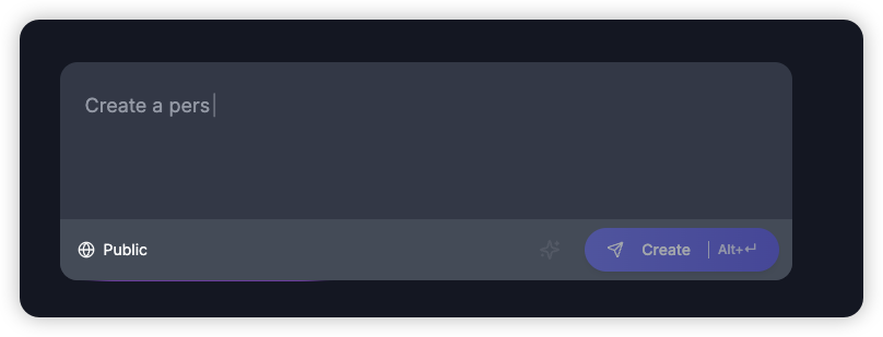
screenshot
Summary by CodeRabbit
.gitignoreto include new entries forcontainer-state.jsonandport-state.json.