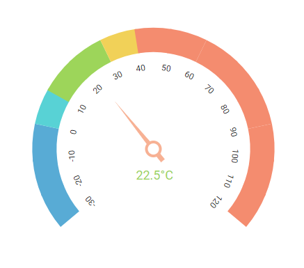
The React Circular Gauge component is ideal to visualize numeric values over a circular scale. All the circular gauge elements are rendered using Scalable Vector Graphics (SVG).
Getting started . Online demos . Learn more
Trusted by the world's leading companies

You can use create-react-app to setup applications. To create React app use the following command.
npx create-react-app my-app --template typescript
cd my-app
npm startAll Syncfusion React packages are published in the npmjs.com registry. To install the React Circular Gauge package, use the following command.
npm install @syncfusion/ej2-react-circulargauge --saveIn the src/App.tsx file, use the following code snippet to render the Syncfusion React Circular Gauge component.
import React from 'react';
import { CircularGaugeComponent } from '@syncfusion/ej2-react-circulargauge';

function App() {
   return (<CircularGaugeComponent></CircularGaugeComponent>);
}
export default App;Circular Gauge component is also offered in the following list of frameworks.
 JavaScript |
 Angular |
 Vue |
 ASP.NET Core |
 ASP.NET MVC |
|---|
- Arc Gauge/Radial Gauge: The arc gauge or radial gauge helps in the visualization of numerical values of scales in a semi-circular or quarter-circular manner. It is possible to achieve this by changing the start and end angle values.
- Axes: Axes is a collection of circular axis that can be used to indicate numeric values.
- Ranges: Supports ranges to categorize the axis values. Any number of ranges can be added to the circular gauge.
- Ticks and labels: Provides options to customize the ticks and labels of the gauges.
- Pointers: Indicates the values on axis. Circular gauge supports three types of pointers: needle, range bar, and marker.
- Annotation: Uses any custom HTML element as annotation and place it anywhere on the gauge.
- Legend: Summarizes the information from the ranges.
- Tooltip: Provides information about the pointer and range values on hover.
- Pointer drag: Provides support to place a pointer at the desired values by dragging it.
- Range drag: Provides support to extend the start or end of the range at the desired values by dragging it.
- Print and Export: Prints or exports the rendered circular gauge to a desired format. Exporting supports four formats: PDF, PNG, JPEG and SVG.
- Templates: Templates can be used to create custom user experience in the tooltip of the circular gauge.
- Globalization: Personalize the circular gauge component with different languages, as well as culture-specific number, date and time formatting.
- Accessibility: Provides with built-in accessibility support which helps to access all the circular gauge component features through the keyboard, screen readers, or other assistive technology devices.
Product support is available through the following mediums.
- Support ticket - Guaranteed Response in 24 hours | Unlimited tickets | Holiday support
- Community forum
- GitHub issues
- Request feature or report bug
- Live chat
Check the changelog here. Get minor improvements and bug fixes every week to stay up to date with frequent updates.
This is a commercial product and requires a paid license for possession or use. Syncfusion’s licensed software, including this component, is subject to the terms and conditions of Syncfusion's EULA. To acquire a license for 80+ React UI components, you can purchase or start a free 30-day trial.
A free community license is also available for companies and individuals whose organizations have less than $1 million USD in annual gross revenue and five or fewer developers.
See LICENSE FILE for more info.
© Copyright 2024 Syncfusion, Inc. All Rights Reserved. The Syncfusion Essential Studio license and copyright applies to this distribution.